Do you have a favourite font for on-screen work? Or do certain fonts hurt your eyes the minute you open the file?
I’ve been working on a short translation project consisting of two interview transcripts of about 600 words each. Both of the source texts were in Arial 12-point, justified, without a single paragraph break. It made me feel dizzy just to look at them. The first thing I did, before even thinking about paragraph breaks, was to change them to Verdana, my preferred font for on-screen work.
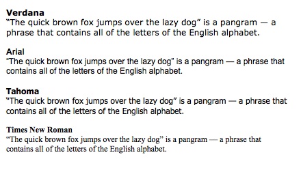
We had a Twitter conversation about this. Times New Roman got a definite thumbs-down and Arial more nays than yays, while views on Verdana were about equally balanced. Tahoma also got a good review. Here’s a comparison (all 12-point):
A proofreading tip
Karen Tkaczyk (aka @ChemXlator) offered a useful tip: if you change the font for proofreading, you’ll pick up different aspects of your text that you wouldn’t otherwise have noticed. She says it works both on-screen and, her preferred method, on paper.
My own proofreading method is to print out the text and read it on paper, but for times when you don’t have access to a printer changing the font sounds like a good idea. And I’ll definitely try changing the font next time I proofread on paper.
Gillian Hargreaves (@ghargreaves) also prints out for the final check. She uses a CAT tool (memoQ, default font Tahoma) on-screen and prints out in the source text font – so again, a change of font for the final read-through.
What about you? What are your favourite/least favourite fonts for on-screen work? Or do you have any proofreading tips to share?
Other posts you might like:
Cut printing costs: use Century Gothic
Nouning and verbing: an ask too far?
Smart quote-marks for smart translating
By Marian Dougan

13 responses
On the subject of fonts do try and choose Century Gothic if you need to print – it uses about 30% less ink than Arial and about 35% less than Tahoma (only slightly less than Times New Roman though).
Another option is ecofont, but you’re right – Century Gothic uses even less.
I haven’t actually printed a document for proofing in a long time but it’s worth considering, especially when you are getting started. It takes a while to learn how to catch your own mistakes. After that, using a different font onscreen may be enough. It fits in my workflow (DVX2, proofing in External View.)
Another trick is to change the font by one or two sizes, or change the margin by an inch or two. Either one causes the line breaks to occur in different places, forcing you to look at the test differently. For example, you may have seen an example like this one, which has two mistakes:
For he’s a
a jolly good
fellow. A
stitch in
in time saves
nine.
Steven Marzuola
Thanks, Steven. I find it really hard to catch all my mistakes on screen, especially when it’s a question not of spelling/typos but of style. It’s only when I see the text on paper that I really see what works or doesn’t work.
Like you, I change font size for the final read-through – to 8 or 8.5 (if I’m using Verdana)
I never even thought about different fonts printing with different amounts of ink… Thanks for the tips!
For proofreading, especially later at night, I don’t change the font itself—I increase the font size. I like to make the text big enough that it’s like a standard news column; only 10-12 words per line, maximum. It helps change the line breaks and gives my eyes a rest.
Yes, there’s even a font called “Ecofont” that’s got holes in it to reduce ink use. But Century Gothic apparently uses even less.
As for proofreading, I always print out the document but in a smaller point size – I use 12 on-screen but 8 or 8.5 on paper. So again, it changes the visual effect. It’s interesting that you prefer to use a bigger font size.
I have to say that I don’t have any issues with fonts, i.e. I have never changed a font just because it was irritating when translating. I am a fan of Times New Roman, though.
As for proofreading techniques, nothing beats reading the text on paper, but I will definitely try out changing the font (perhaps into Verdana)! Thank you for an interesting post!
Thanks for your comment, Ewa. My problem with fonts like Arial on-screen is that I find them hard to read, it’s not just an aesthetic question. And I agree – you see so much more when you read the text on paper. Like you, I’ll be trying the font-change technique for my proofreading.
Thanks for the tip on changing fonts when proofreading. What a clever trick! I will definitely try it next time.
I agree, Times New Roman is so outdated! I really like Verdana, Tahoma or Calibri – they are all light and easy to read without too much effort! However, one of my pet peeves is when the text is not justified – eek!
Thanks for commenting, Emeline. I use Calibri for letters, invoices etc on my business letterhead. I prefer non-justified, I find it easier to read (and it eliminates big gaps in the text, especially when you’ve got lots of long words).
I’ve been wearing glasses since 18 months, so habitually use Arial to proofread. But- I see verdana is even clearer to see : ) Thanks!
I wear glasses too, for reading and computer work, and I find Verdana much easier to read. That’s why I prefer it – it’s a practical rather than aesthetic choice.