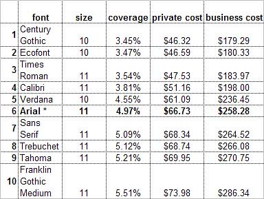
A test conducted by Printer.com compared ink consumption for different fonts. Century Gothic was found to use 30% less ink than Arial, used as a benchmark, and less even than Ecofont, designed with low consumption in mind.
I use Century Gothic a lot as I like fonts with open “a” counters. For my old logo, my designer chose Avant Garde, which I installed on my Mac to keep my business documents consistent with the logo. However, I found Avant Garde hard on the eye for large bodies of text. Century Gothic is similar in appearance but in my view more readable. So for a time Century Gothic was (and still is, for some texts) my font of choice for business and marketing letters.
Ink consumption by a given font depends mainly on the thickness of its lines. Century Gothic, its slender lines notwithstanding, is a wide font, so takes up more space and could consume more paper. The simple solution is to reduce your character size (10 is comfortable).
As Dinesh Ramde reports for Associated Press, some font experts give Century Gothic a lower readability score than Times New Roman or Arial. It’s intended for limited blocks (titles and headlines, for example) rather than extended bodies of text. In my experience it may be less readable but is by no means unreadable. I much prefer it to Arial. All things being equal, my favourite working font is Verdana, which comes 5th in Printer.com’s consumption/cost table, shown below:

The following tips could help you save on printing and paper costs:
- print in draft mode when you can
- use both sides of the page
- if you can’t/don’t print on both sides, keep any printouts you don’t need and re-use for future drafts
- use the “print preview” function. If some of your pages have unnecessary text or just 1 or 2 lines, edit or adjust the line-spacing/font size accordingly.
- “go to” the last page of your document. Again, if it’s only got 2 or 3 lines of text, tweak or edit. Reducing font size by half a point, from 11 to 10.5, for example, may be enough to reduce your page count
- make sure you’re not printing pages with useless text such as a copyright line or lengthy footer/header text
- don’t print unless you need to – especially emails.
But. If you’re a writer, editor or translator, then the most reliable quality-check is to print out and read your text on paper before finalising and delivering to your publisher or client or posting on your web site. It’s the best way to pick up typos, clunky structure, spelling errors, repetitions and simple bad writing.
Keep your environmental conscience clear by choosing a suitable font and character size and reprinting on/recycling your paper.
Photo courtesy of Andreas Brændhaugen.
By Marian Dougan

2 responses
Thanks for the great post! We linked to it from our blog, Medical Translation Insight.
Thanks for linking! I see you’re font geeks – I love fonts too. Have you got a favourite?